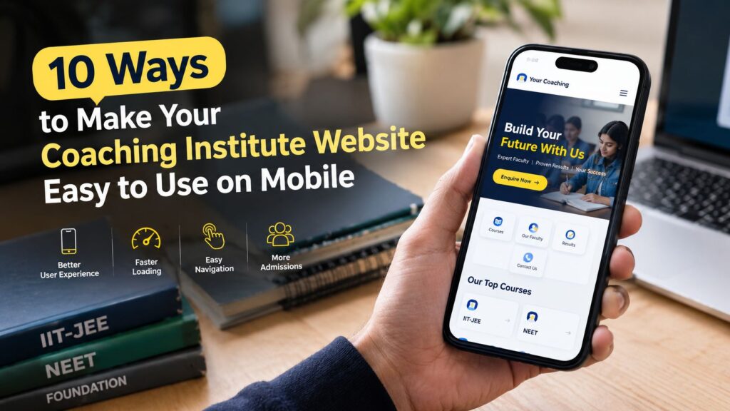
Coaching Website Features: 10 Essential Things Your Institute Needs
Coaching Website Features: 10 Essential Things Your Institute Needs Parents and students don’t walk into a coaching center blindly anymore. They search online, open a few websites, and decide who to call in the first few seconds. If your site is missing the right details, they simply move on to the next institute. So what should a coaching institute website include? This guide covers the coaching website features that matter most, in simple language. Whether you are building a new site or improving an old one, each feature here is practical and easy to apply. Want an expert to look at your site and tell you which coaching website features you are missing? Get a free one-on-one consultation with AdxVenture and find out exactly what to fix first. Why Coaching Website Features Matter Your website works like a front desk that never closes. It answers questions at night, on weekends and while your team is busy teaching. The right coaching website features turn a visitor into an enquiry, and an enquiry into an admission. The wrong ones do the opposite. A site with no fees, no faculty details and no phone number leaves parents with questions. Unanswered questions mean lost students. Let’s go through the ten features that fix this. 1. A Clear Homepage With Courses and Location The homepage is the first of all coaching website features, because every visitor sees it first. Within five seconds, someone should know what you teach, who it is for and where you are. Use a headline like “NEET Coaching in Mohali” instead of a vague “Welcome to our institute”. Add one clear button, such as Book a Free Demo, above the fold. Keep the first screen simple: one headline, one short line and one main action. 2. A Separate Page for Every Course Give each course its own page, whether it is JEE, NEET, CUET, Class 10 boards or IELTS. Each page should show the batch timings, duration, fees (or a way to ask), faculty and an enquiry button. Separate pages help parents find what they want without hunting through menus. They also help each course rank in Google, because a page focused on one topic performs better than a single page covering everything. 3. Detailed Faculty Profiles “Expert faculty” is a phrase every institute uses, so it convinces nobody. Show real names, photos, qualifications, years of experience and subjects taught instead. A short introduction video from your best teachers builds trust even faster. Parents want to know who will actually teach their child. A clear faculty section is one of the strongest coaching website features you can add. 4. Real Results and Honest Testimonials Numbers build belief. A line like “120 students selected in 2026” is far more convincing than “many students succeed with us”. Add topper photos, parent reviews and, if possible, short video testimonials. Organize results by year and course, and update them every year. Old results make a center look inactive, even when the teaching is excellent. Keep everything real and verifiable, because parents often check. 5. Click-to-Call and WhatsApp Buttons Many parents want to talk to a person before they decide. Add a tappable phone number and a WhatsApp chat button on every important page. Place the number at the top of the page, not buried in the footer. Use a pre-filled WhatsApp message such as “Hi, I want details about JEE coaching”, so parents can start a chat in one tap. Among all coaching website features, this one usually brings the fastest enquiries. 6. A Short, Simple Enquiry Form Ask only for what your team really needs: name, phone number, course of interest and a short message. Long forms are hard to fill on a phone, and most visitors will quit halfway. Show a clear confirmation message after the form is submitted, and make sure someone replies quickly. An enquiry that waits two days for an answer is usually a lost admission. 7. Clear Fee, Batch and Scholarship Information Hidden fees destroy trust. Share fee ranges, instalment options, batch sizes and scholarship test details, or at least give a clear way to request them. If you cannot publish exact fees, explain what affects the price, such as course duration or batch type. Parents respect institutes that are open about costs. That honesty is one of the most underrated coaching website features. 8. Mobile-Friendly Design and Fast Loading Most parents and students will open your site on a phone. If the text is tiny, the buttons are hard to tap or the page loads slowly, they will leave within seconds. Compress your images, avoid heavy sliders and pop-ups, and test the site on a real phone. Use Google Page Speed Insights to check your speed and aim to load in under three seconds. Large topper photos are the most common reason coaching sites feel slow. 9. Google Map, Contact Details and Branch Pages Make it easy for parents to find you. Embed a Google Map on your contact page. Keep your name, address and phone number exactly the same everywhere, including your Google Business Profile. If you have more than one branch, create a separate page for each location with its own address and timings. This also helps your local search visibility, since parents often search with their area name, such as “coaching in Panchkula”. 10. Trust Signals and Helpful Content Small details tell parents whether your institute is serious. Make sure your site uses HTTPS (the padlock in the browser), has working links and shows up-to-date notices and batch dates. Add an about page, a privacy policy and a photo gallery of your classrooms. Then go one step further with a blog. Posts on exam tips, admission guidance and study planning bring in new visitors. Even one useful post a month adds up over time. This is one of the coaching website features that keeps working long after you publish it. ✅Quick Coaching Website Features Checklist ☐ Clear homepage with courses and location ☐ Separate