10 Best Ways to Make Your Coaching Institute Website Easy to Use on Mobile
Students and parents often use their phones to research coaching classes. They may compare institutes while travelling, check a batch schedule during a break, or look for an admissions contact number. If your website is difficult to read or navigate, they may leave before discovering what your classes offer.
A mobile-friendly coaching institute website helps visitors find courses, understand your teaching approach and contact your team. It should load quickly, fit different screen sizes and make important information easy to scan. These features are useful for tuition centers, exam academies, professional training institutes and language classes.
Here are practical tips to improve your coaching website design for mobile visitors. Each tip focuses on making your site easier to browse and helping prospective students find the information they need. Use them to review your existing website or plan a new one.
Planning a new website for your coaching institute, or want to fix your current one? Get a free one-on-one consultation with AdxVenture before you start and get expert advice on your next step.

Call now to book your free session.
1. Choose a responsive website layout
A responsive website adjusts its layout to suit the visitor’s screen. A desktop page may show course cards side by side, while the mobile version stacks them vertically. This makes information easier to read without zooming or scrolling sideways.
When planning a mobile-friendly coaching institute website, check how it appears on phones and tablets. Navigation, images, forms, headings and buttons should resize or reposition neatly. Important content should not be cut off or hidden behind other elements.
Review your homepage, course details, faculty profiles, admissions information and contact page. A responsive coaching website creates a more consistent experience across devices. It also helps your institute appear organized and professional.
2. Keep the mobile menu simple
A crowded menu makes it harder for visitors to find information. Keep mobile navigation short and use labels students and parents will recognize. Visitors should be able to tell where each link leads without guessing.
A coaching website might include these menu sections:
- Courses
- About Us
- Faculty
- Results or Student Stories
- Admissions
- Contact
If you offer several programs, group them under “Courses” instead of listing every course in the menu. Make the menu button easy to spot and ensure it opens and closes smoothly. Choose clear labels such as “Admissions” instead of vague wording like “Explore More.”
Simple navigation is an important part of effective coaching institute website design. It helps visitors move from your homepage to course or contact information. Keep the menu consistent across pages so users do not have to learn a new layout each time.
3. Make text comfortable to read
Small text can make a mobile page frustrating to use. Choose a legible font size and leave enough space between lines and paragraphs. Visitors should be able to read course details without pinching and zooming.
Break long sections into short paragraphs with descriptive headings. Use bullet points for information such as subjects, class timings, batch options and eligibility. This makes your content easier to scan, especially for parents comparing coaching classes.
Think about what a prospective student might ask: What does the course cover? Who teaches it? When do classes run? How can I enquire? A useful website for coaching classes answers these questions clearly and keeps important details easy to find.
4. Make buttons easy to tap
Links and buttons need enough space to be tapped accurately on a touchscreen. If they are too small or crowded together, visitors may select the wrong option. Some may give up instead of trying again.
Use clear labels for important actions, such as:
- Enquire About This Course
- Call the Institute
- View the Batch Schedule
- Book a Counselling Session
- Apply for Admission
Place each button near the information it relates to. For example, add an enquiry button to the course page rather than making visitors return to the homepage. Choose one main action for each section so the page does not feel cluttered.
A clear call to action is a useful part of mobile-friendly coaching institute website design. It tells visitors how to move forward without making them guess. Use specific button text so people know what will happen when they tap.
5. Make it easy to contact your institute
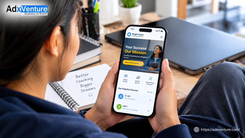
Some visitors want to speak with someone before choosing a course. Make your phone number, address and enquiry options easy to find on mobile. Where possible, make the phone number tappable and link your address to a map.
Keep enquiry forms short and ask only for details your team needs to respond. These could include a name, phone number, course of interest and a short message. Forms with too many fields can be difficult to complete on a small screen.
Use visible labels and clearly show which fields are required. If someone enters information incorrectly, display a helpful message explaining how to fix it. A smooth contact experience can encourage visitors to make an admission enquiry.
6. Improve loading speed
Visitors may be using a slow or unstable connection, so avoid oversized files and unnecessary effects. Compress images before adding them to the website. Review third-party features too, since some may add extra loading time.
Pay attention to what appears at the top of each page. Visitors should quickly see your institute name, the classes you offer and a useful next step. They should not have to wait for a large image or animation to finish before finding important information.
Fast-loading pages are an important part of good coaching institute website design. They make browsing more convenient and keep attention on your courses and admissions information. Check loading speed after adding new images, videos or website features.
7. Organize course pages for quick scanning
A course page should explain the essentials in a format that is easy to follow. Divide information into sections so students can find what they need without reading one long block of text. Use clear headings and a consistent layout.
Consider including these sections:
- Course overview
- Subjects covered
- Batch schedule
- Teaching format
- Faculty
- Eligibility or requirements
- Enquiry details
Use a similar structure across courses so students can compare them more easily. Avoid putting essential information only in images, as image text may be difficult to read on mobile. Keep course details available as regular text on the page.
Include relevant search terms naturally in page titles and headings. Course names, subjects, exam names and locations may be useful when they accurately describe your services. Avoid repeating keywords unnaturally; clear information is more helpful to readers.
8. Use relevant, well-sized images
Photos of classrooms, faculty and learning activities can help visitors understand your institute. Choose clear, relevant images and size them appropriately for mobile. Oversized images may take too long to load or dominate the screen.
Add descriptive alternative text to meaningful images. For example, a classroom photo might use the alt text “students attending a mathematics coaching class.” This describes the image to visitors using assistive technology and provides context if it does not load.
Use images to support your message, not replace it. Course schedules and admission instructions should remain available as readable page text. This makes essential details easier to access, even when an image is slow to load.
9. Reduce mobile distractions
Pop-ups, auto-playing videos and large banners can interrupt browsing, especially if they cover most of a phone screen. Use these features sparingly and make sure visitors can close them easily. They should not have to dismiss several pop-ups to read a course description.
Keep your visual design focused on what students and parents need. Courses, teaching information, results, admissions and contact options should be easy to find. A clean layout makes your coaching institute website easier to use and helps important information stand out.
Review each page from a mobile visitor’s point of view. Ask whether a banner, animation or pop-up makes the page more useful or simply adds clutter. If it does not help visitors find information or take action, consider removing it.
10. Test the whole experience on a phone
Do not rely only on how a page looks in a desktop preview. Open your website on a phone and try the complete visitor journey. Find a course, read its details, tap the call button and submit an enquiry form.
Look for text that is cut off, buttons that are difficult to tap, images that load slowly and menus that are hard to open. Check that forms are simple to complete. Ask a few students or parents to try the site too; their feedback may reveal issues you have missed.
Repeat these checks when you add a course, update admissions information or change a form. Mobile usability is not a one-time task; it should be part of maintaining your website. Regular testing helps ensure that your mobile-friendly coaching institute website continues to work well for prospective students and parents.
Make your coaching website work better on mobile
A successful mobile-friendly coaching website does more than fit a desktop page onto a smaller screen. It helps prospective students understand your courses, find key information and contact your team with less effort. Responsive design, simple navigation, readable content and clear calls to action all contribute to a better experience.
If visitors have trouble browsing your website on their phones, start by checking the homepage, course pages and contact page. AdxVenture can help coaching institutes present their services clearly and create a smoother enquiry journey. A well-planned mobile experience can make it easier for students and parents to take the next step.
Quick tips: mobile website checklist
- ✅ Check that every page works on common phone screen sizes.
- ✅ Use a short menu with clear labels.
- ✅ Make text, links and buttons easy to read and tap.
- ✅ Put course details and contact information where visitors can find them quickly.
- ✅ Keep enquiry forms short and simple.
- ✅ Compress images and avoid unnecessary effects.
- ✅ Test calls, forms, menus and links on an actual phone.
- ✅ Use keywords naturally in relevant headings and page copy