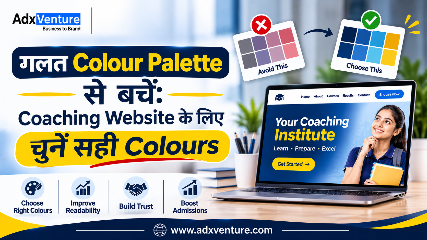
गलत Colour Palette से बचें: Coaching Website के लिए चुनें सही Colours
Best colour palette for coaching website चुनना सिर्फ Design को सुंदर बनाने तक सीमित नहीं है। सही Colours आपके Coaching Institute की Brand Identity को मजबूत करते हैं और Students व Parents के बीच Professional और Trustworthy Image बनाने में मदद करते हैं।
बहुत सारे Bright Colours, कम Contrast और अलग–अलग Button Colours Website को Confusing बना सकते हैं। आइए जानते हैं कि अपने Coaching Institute के लिए सही Colour Palette कैसे चुनें, कौन–से Colour Combinations बेहतर हैं और किन Design Mistakes से बचना चाहिए।
Best colour palette for coaching website चुनना क्यों जरूरी है?
Coaching Institute की Website पर Students और Parents अलग-अलग जरूरतों के साथ आते हैं, जैसे Competitive Exams या School Coaching की जानकारी लेना। ऐसे में सही Visual Design उन्हें जरूरी Information आसानी से समझने में मदद करता है।
एक अच्छी Colour Palette चार मुख्य चीजों को बेहतर बनाती है:
- Brand Recognition: सभी Platforms पर समान Colours से Brand Identity मजबूत होती है।
- Visual Hierarchy और Readability: Important Information और Buttons आसानी से दिखाई देते हैं।
- User Experience: Consistent Colours Visitors को सही Information और Actions तक पहुँचने में मदद करते हैं।
ध्यान रखें, Colours सीधे Admissions नहीं बढ़ाते, लेकिन बेहतर Website Experience और Enquiry Journey बनाने में मदद कर सकते हैं।
Coaching institute website color psychology को समझें
Colour Psychology बताती है कि अलग-अलग Colours लोगों की Emotions और Perceptions को कैसे प्रभावित कर सकते हैं।2025 की एक Systematic Review में 132 Research Papers और 64 देशों के 42,266 Participants के Findings का विश्लेषण किया गया। Research में Colours और Emotions के बीच कई Consistent Associations देखे गए। हालांकि, Colour का प्रभाव उसके Context, Brightness और Saturation पर भी निर्भर करता है।
1. Blue – Trust और Professionalism
Blue एक अच्छा विकल्प हो सकता है उन Institutes के लिए जो अपने Brand को Professional, Disciplined और Trustworthy दिखाना चाहते हैं।
Suitable for:
- Competitive Exam Coaching
- UPSC और SSC Institutes
- Banking और Government Exam Preparation
- Online Learning Platforms
Dark Navy Blue को Headings, Navigation और Important Sections में इस्तेमाल किया जा सकता है।
2. Green – Growth और Progress
Green को अक्सर Growth, Balance और Progress से जोड़ा जाता है। यह उन Institutes के लिए उपयोगी Design Direction हो सकती है जो Conceptual Learning, Skill Development और Long-Term Student Growth पर ध्यान देते हैं।
Suitable for:
- Skill Development Institutes
- Language Learning Centres
- Academic Coaching
- Professional Training Institutes
Green के साथ White या Light Cream का इस्तेमाल Website को साफ और Balanced बना सकता है।
3. Orange – Energy और Action
Orange एक Attention-Grabbing Colour है। इसका उपयोग महत्वपूर्ण Buttons, Limited-Time Admission Announcements या अन्य Action Elements को Highlight करने के लिए किया जा सकता है।
Suitable for:
- Entrance Exam Coaching
- Coding और Technology Courses
- Young Learner Programmes
- Test Preparation Institutes
पूरी Website को Orange बनाने के बजाय इसे Accent Colour के रूप में इस्तेमाल करना बेहतर है।
4. Yellow – Attention और Highlighting
Yellow का उपयोग Important Notices, Highlights और छोटे Visual Elements के लिए किया जा सकता है।
उदाहरण के लिए, Course Page पर New Batch, Important Dates या Scholarship Information को Highlight किया जा सकता है। लेकिन Light Yellow Background पर White Text का इस्तेमाल न करें। इससे Text पढ़ना मुश्किल हो सकता है।

अपने Coaching Institute के लिए Professional Website बनवाना चाहते हैं?
आज ही Adxventure को Call करें 📞 +91-9149214580
Best Colours for Coaching Institute Website कैसे चुनें?
Colour चुनने से पहले अपने Institute की वास्तविक Identity समझें। केवल यह देखकर Colour Select न करें कि दूसरी Coaching Website पर कौन-सा Colour अच्छा दिख रहा है।
इन पाँच बातों पर ध्यान दें।
1. अपने Target Students को समझें
सबसे पहले समझें कि आपकी Coaching किस Age Group और Audience को Target करती है। Class 6–12 के Students के लिए Friendly Colours, जबकि UPSC, SSC और Banking Coaching के लिए Professional Colour Combinations बेहतर हो सकते हैं। Parents की Preferences को भी ध्यान में रखें, क्योंकि Admission Decision में उनकी अहम भूमिका होती है।
2. Courses और Teaching Approach को ध्यान में रखें
आपके Courses और Teaching Style के अनुसार Website Colours चुने जाने चाहिए। Coding Classes के लिए Blue और Teal, जबकि School-Level Coaching के लिए Blue, Green और Light Neutral Colours इस्तेमाल कर सकते हैं। Colours आपके Institute की Teaching Approach और Brand Personality से Match होने चाहिए।
3. अपने Existing Brand Colours को प्राथमिकता दें
अगर आपके Institute का Logo पहले से मौजूद है, तो उसी के Primary और Secondary Colours से Website Palette तैयार करें। इन्हें Headings, Buttons, Icons और Backgrounds में Consistently इस्तेमाल करें। इससे Website, Social Media Posts, Admission Brochures और Offline Banners में एक जैसी Brand Identity बनी रहेगी।
4. Mobile और Desktop दोनों पर Colours Test करें
आपकी Website Mobile और Desktop दोनों Devices पर अच्छी दिखाई देनी चाहिए। Navigation Menu, Course Cards, Enquiry Forms और Admission Buttons को अलग-अलग Screen Sizes पर Check करें। खासतौर पर Text Readability, Button Visibility और Colour Contrast पर ध्यान दें।
5. Colours को वास्तविक Users के साथ Test करें
Final Colour Palette चुनने से पहले उसका Prototype Students, Parents और Admission Counsellors को दिखाएँ। उनसे पूछें कि क्या Text आसानी से पढ़ा जा रहा है और Enquiry Buttons स्पष्ट दिखाई दे रहे हैं। उनके Feedback के आधार पर जरूरी बदलाव करें, ताकि Website सभी Visitors के लिए आसान हो।
AdxVenture के साथ अपने Coaching Institute की Professional Website बनवाएं
Adxventure को 15+ years of experience है Website Design और Digital Marketing के क्षेत्र में। हमने Education Centers, Colleges और अन्य Educational Institutions के लिए कई Websites बनाई हैं। इस अनुभव के आधार पर हम समझते हैं कि एक Coaching Institute की Website में कौन-से Features होने चाहिए और Students व Parents को किस तरह की Information चाहिए। हम आपकी Website के लिए सही Colour Palette, Professional Design, Mobile-Friendly Layout और SEO-Friendly Structure तैयार करने में मदद करते हैं।
अपने Coaching Institute के लिए Professional और Lead-Focused Website बनवाने के लिए आज ही Adxventure से जुड़ें।
Explore Our Packages – Starting from Rs. 7,999/-
Professional Website Colour Combinations: 3 Practical Examples
अब कुछ ऐसे Colour Combinations देखते हैं जिन्हें Coaching Website के लिए Starting Point की तरह इस्तेमाल किया जा सकता है। ये Universal Rules नहीं हैं। अपने Logo, Audience और Brand Positioning के अनुसार इनमें बदलाव करें।
Combination 1: Professional Blue and Teal
| Colour | HEX Code | Suggested Use |
| Navy Blue | #17365D | Header और Headings |
| Teal | #159A9C | Primary Buttons और Highlights |
| White | #FFFFFF | Main Background |
| Light Grey | #F3F6FA | Course Cards और Sections |
Best for: UPSC, SSC, Banking और Competitive Exam Institutes.
यह Combination Professional और Structured Visual Identity बनाने के लिए अच्छा Starting Point है।
Combination 2: Green and Cream
| Colour | HEX Code | Suggested Use |
| Deep Green | #205B45 | Headings और Header |
| Soft Green | #DCEEE4 | Background Sections |
| Cream | #FFF9EC | Main Background |
| Charcoal | #263238 | Body Text |
Best for: Academic Coaching, School Tuition और Skill Development Institutes.
यह Combination एक शांत और Balanced Website Design तैयार करने में मदद कर सकता है।
Combination 3: Navy and Orange
| Colour | HEX Code | Suggested Use |
| Navy Blue | #192F55 | Header और Headings |
| Orange | #F28C28 | CTA Buttons और Highlights |
| White | #FFFFFF | Main Background |
| Light Blue | #EAF2FA | Secondary Sections |
Best for: Entrance Exam Preparation, Coding Classes और Technology Training Institutes.
इस Combination में Orange का इस्तेमाल सीमित रखें ताकि Important Buttons बाकी Design से अलग दिखाई दें।
क्या 60-30-10 Colour Rule इस्तेमाल करना चाहिए?
Website Design में 60-30-10 Rule एक उपयोगी Starting Framework है:
- 60% Primary Colour: मुख्य Background और बड़े
- 30% Secondary Colour: Cards, Navigation और Supporting Elements.
- 10% Accent Colour: CTA Buttons और Important Highlights.
उदाहरण के लिए, White Background 60%, Navy Blue 30% और Teal 10% रखा जा सकता है।
यह कोई Mandatory Rule नहीं है। इसे अपने Website Layout और Content के अनुसार Adjust करें। Nielsen Norman Group भी Colour Balance, Contrast और Consistent Interface Colours पर जोर देता है।
Color mistakes to avoid when designing a coaching website
सही Colour Combination चुनने के साथ-साथ गलत Design Practices से बचना भी जरूरी है।
1. बहुत सारे Colours का इस्तेमाल करना
हर Section में अलग Colour इस्तेमाल करने से Website का Visual Design बिखरा हुआ लग सकता है। शुरुआत में 3–4 Core Colours चुनें और जरूरत के अनुसार उनके Light और Dark Shades इस्तेमाल करें।
2. Low Contrast वाले Colours चुनना
Light Grey पर White Text या Yellow पर White Text पढ़ना मुश्किल हो सकता है। W3C के WCAG 2.2 Level AA Guidelines के अनुसार Normal Text के लिए कम से कम 4.5:1 और Large Text के लिए 3:1 Contrast Ratio होना चाहिए। अपने Colours को WebAIM Contrast Checker से Test करें।
3. हर Button को अलग Colour देना
अगर Apply Now, Download Syllabus, Contact Us और Enquire Now सभी अलग-अलग Bright Colours में हैं, तो Visitor के लिए Important Action पहचानना मुश्किल हो सकता है। एक Primary CTA Colour निर्धारित करें और इसे मुख्य Conversion Actions के लिए Consistently इस्तेमाल करें।
4. केवल Colour से Information बताना
मान लीजिए Enquiry Form में गलत Information भरने पर केवल Red Border दिखाई देता है। कुछ Users इसे आसानी से पहचान नहीं पाएँगे। Error Message के साथ Text, Icon और Clear Instructions भी दें। इसी तरह Required Fields को केवल Colour से नहीं, बल्कि Label या Symbol से भी पहचानने योग्य बनाएं।
5. Competitors की Palette को Copy करना
आपके Competitor की Website पर Dark Blue अच्छा दिखता है, इसका मतलब यह नहीं कि वही Colour आपके Institute के लिए भी सबसे अच्छा होगा। अपने Brand Positioning, Logo और Audience के अनुसार Palette चुनें।
Website Colour Palette का SEO और AI Search Visibility से क्या संबंध है?
एक महत्वपूर्ण बात समझना जरूरी है कि Google किसी Website को केवल Blue, Green या Orange Colours इस्तेमाल करने के कारण Higher Ranking नहीं देता। हालांकि, सही Colour Selection Website की Readability, Accessibility और Overall User Experience को बेहतर बना सकता है। इसका SEO और Lead Generation पर Indirect Impact पड़ सकता है। इसलिए Colour Palette चुनते समय Design के साथ Website Performance और User Experience पर भी ध्यान देना चाहिए।
1. Colours, Readability और Core Web Vitals
Website के Colours का चुनाव करते समय Readability और Page Performance दोनों को ध्यान में रखना चाहिए। Google के Core Web Vitals में तीन मुख्य Metrics शामिल हैं: LCP (2.5 Seconds या कम), INP (200 Milliseconds से कम) और CLS (0.1 से कम)। ये Website की Loading Speed, Responsiveness और Visual Stability को Measure करते हैं। Heavy Background Images, Unoptimised Graphics और Unnecessary Animations से बचें और Optimised WebP या AVIF Images तथा Lightweight Design Elements इस्तेमाल करें।
2. AI Overviews और AI Search के लिए Website Design
Google Search में AI Overviews और AI Mode के बढ़ते इस्तेमाल के साथ Website Content को Clear, Accessible और Well-Structured रखना जरूरी है। अपने Courses, Fees, Eligibility और Admission Details को केवल Images में दिखाने के बजाय Actual Text के रूप में भी उपलब्ध कराएं। Clear Navigation, Relevant Internal Links, Descriptive Image Alt Text और Visible Content से Match करता Structured Data इस्तेमाल करें। Google की Official Guidance के अनुसार AI Search के लिए किसी अलग Special Schema की जरूरत नहीं है; Strong SEO Fundamentals अभी भी महत्वपूर्ण हैं।
3. Structured Data और Local SEO
अगर आपका Coaching Institute किसी Particular City में Operate करता है, तो Website पर उसका सही Name, Address, Contact Number, Courses और Working Hours स्पष्ट रूप से दें। अपनी Business Identity के अनुसार Organization या उपयुक्त LocalBusiness Structured Data इस्तेमाल करें और सुनिश्चित करें कि इसकी Information Website पर दिखाई देने वाले Details से Match करती हो। साथ ही, Google Business Profile को Updated रखें और सही Business Information उपलब्ध कराएं। Google के अनुसार Local Search Rankings मुख्य रूप से Relevance, Distance और Prominence पर निर्भर करती हैं, न कि Website के Colour Palette पर।
सही Colours से Website Enquiries और Admissions को कैसे Support करें?
आपकी Website का मुख्य उद्देश्य केवल Courses दिखाना नहीं है। उसे Interested Students और Parents को Enquiry करने का आसान रास्ता भी देना चाहिए।
इसके लिए एक स्पष्ट Conversion Journey तैयार करें:
- Homepage: Institute की पहचान और Main Courses स्पष्ट दिखाएँ।
- Course Pages: Eligibility, Subjects, Faculty और Batch Details दें।
- Admission Information: Fees, Timings और Admission Process की जानकारी रखें।
- CTA Buttons: Apply Now, Enquire Now या Book a Counselling Session जैसे Clear Actions दें।
- Enquiry Form: केवल जरूरी Details माँगें, जैसे Name, Phone Number और Interested Course.
अपने Coaching Website पर Enquiry और Admission Performance समझने के लिए Google Analytics 4 में Form Submissions, Phone Clicks और WhatsApp Clicks Track करें। Successful Enquiry Form Submission को generate_lead Event के रूप में Setup करके Key Event बनाया जा सकता है। इससे पता चलेगा कि कितने Visitors वास्तव में Enquiry कर रहे हैं। CTA Button के Colours को भी Test करें और बदलाव का निर्णय Actual Enquiry Data के आधार पर लें।
Coaching Website Colour Palette: Final Checklist
Website Launch करने से पहले इस Checklist की मदद से अपनी Colour Palette, Design और User Experience को जरूर Review करें।
🎨 1. Brand & Colour Selection
- Colours आपके Institute के Logo और Brand Identity से Match करते हैं।
- Website के लिए 3–4 Core Colours निर्धारित किए गए हैं।
- Primary और Secondary Colours का इस्तेमाल Consistently किया गया है।
👁️ 2. Readability & User Experience
- Headings और Body Text आसानी से पढ़े जा सकते हैं।
- Text और Background के बीच पर्याप्त Colour Contrast है।
- Primary CTA Buttons हर Page पर Consistent दिखाई देते हैं।
- Mobile और Desktop दोनों पर Website Design सही दिखाई देता है।
- Form Errors को केवल Colour से नहीं, बल्कि Text और Icons से भी दर्शाया गया है।
⚙️ 3. SEO, Performance & Lead Generation
- Course Information और Admission Details Text Format में उपलब्ध हैं।
- Website Images Optimised हैं और Core Web Vitals की जाँच की गई है।
- Enquiry Forms और Contact Actions की Tracking सही तरीके से Setup है।
Final Tip: Website Launch करने से पहले अलग-अलग Devices पर Design Test करें और कुछ Students व Parents से Feedback जरूर लें। इससे आप उन छोटी समस्याओं को पहचान सकते हैं जो Visitors के Website Experience और Enquiry Journey को प्रभावित कर सकती हैं।
Website: www.adxventure.com
Call or WhatsApp: +91 91492 14580
Further Reading & Research References ;
- Google Search Central – AI Features and Your Website
- Google Search Central – Core Web Vitals
- W3C – WCAG 2.2 Contrast Guidelines
- Google – Organization Structured Data
- Google Analytics – Key Events
- Google Business Profile – Local Ranking
- Nielsen Norman Group – Using Color to Enhance Your Design
- Systematic Review – Colour and Emotions (2025)
Frequently Asked Questions (FAQs)
1. Coaching Website के लिए Best Colour Palette कौन–सी है?
Coaching Website के लिए Blue, Teal, Green, White और Navy जैसे Colours अच्छे Options हो सकते हैं। सही Colour Palette आपके Institute की Brand Identity, Target Students और Courses के अनुसार चुननी चाहिए।
2. Coaching Institute की Website के लिए कितने Colours इस्तेमाल करने चाहिए?
Website Design के लिए 3–4 Core Colours से शुरुआत करना बेहतर है। इनमें Primary, Secondary, Background और Accent Colours शामिल हो सकते हैं। इससे Website का Design Consistent और Professional दिखाई देता है।
3. Coaching Institute Website Color Psychology क्यों जरूरी है?
Colour Psychology समझने से आप ऐसे Colours चुन सकते हैं जो आपके Institute की Brand Personality और Teaching Approach को बेहतर तरीके से Represent करें। इससे Website का Visual Experience अधिक Meaningful बनाया जा सकता है।
4. क्या Website के Colours SEO Ranking को प्रभावित करते हैं?
केवल Colours बदलने से Google Ranking नहीं बढ़ती। हालांकि, सही Colour Contrast, Readability और User Experience बेहतर Website Design बनाने में मदद करते हैं, जो Overall Website Quality के लिए महत्वपूर्ण हैं।
5. Coaching Website के CTA Buttons के लिए कौन–सा Colour इस्तेमाल करना चाहिए?
CTA Buttons के लिए Orange, Teal या Green जैसे Contrasting Colours इस्तेमाल किए जा सकते हैं। ऐसा Colour चुनें जो Website की बाकी Palette से अलग दिखाई दे और Button पर लिखा Text आसानी से पढ़ा जा सके।